Feedcare Logo Brand Story
Brief:
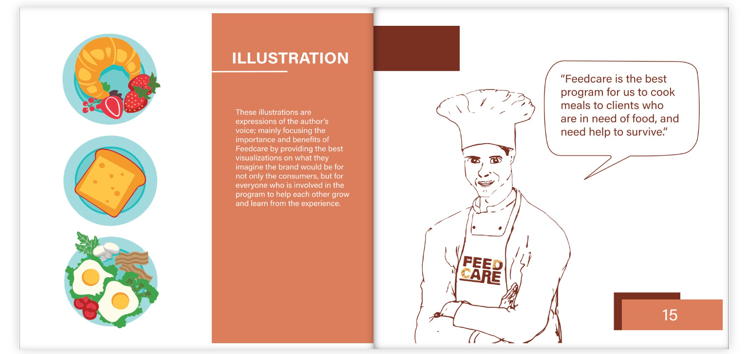
Create a logo for Feedcare, a non-profit organization focused on fighting hunger through acts of care and community support. The logo should be simple, clear, and easily recognizable.
Concept:
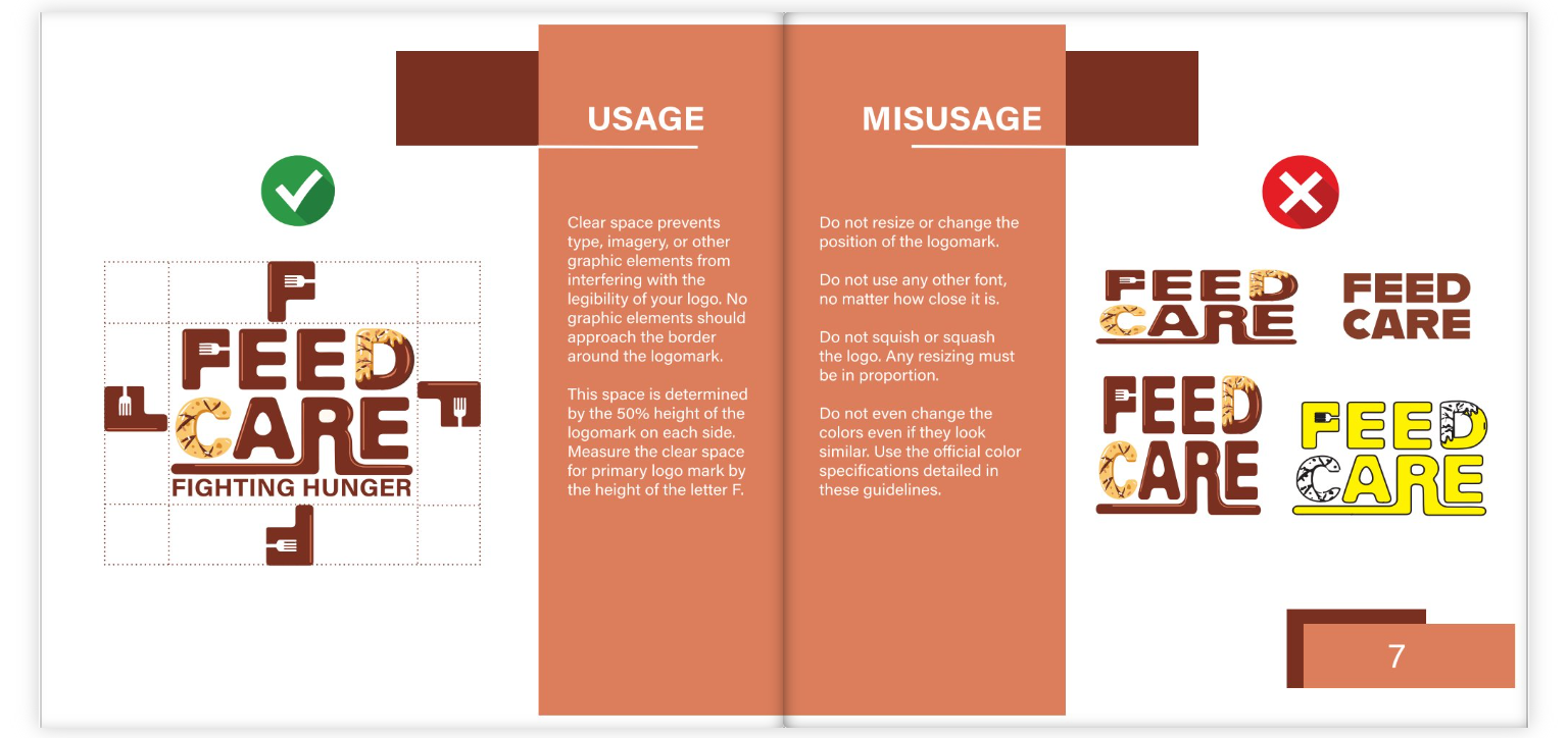
My thought process behind the Feedcare logo involved a focus on simplicity and clarity to effectively communicate the organization’s mission of fighting hunger through care. The choice of incorporating the words “FEED,” CARE,” and “FIGHTING HUNGER” directly in the logo indicates a straightforward approach to conveying the organization’s purpose. The emphasis on these key words suggests a desire to highlight the core values and goals of the Feedcare initiative, aiming to create a strong and memorable visual identity that resonates with its audience. The intention was to create a visually striking logo that not only reflects the organization’s purpose but also resonates with individuals passionate about addressing the issue of hunger.
Logo Sketches
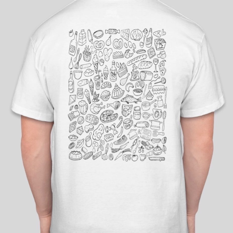
Feedcare Mock-ups
Feedcare Logo Motion Piece

