Client: Cox Car Wash
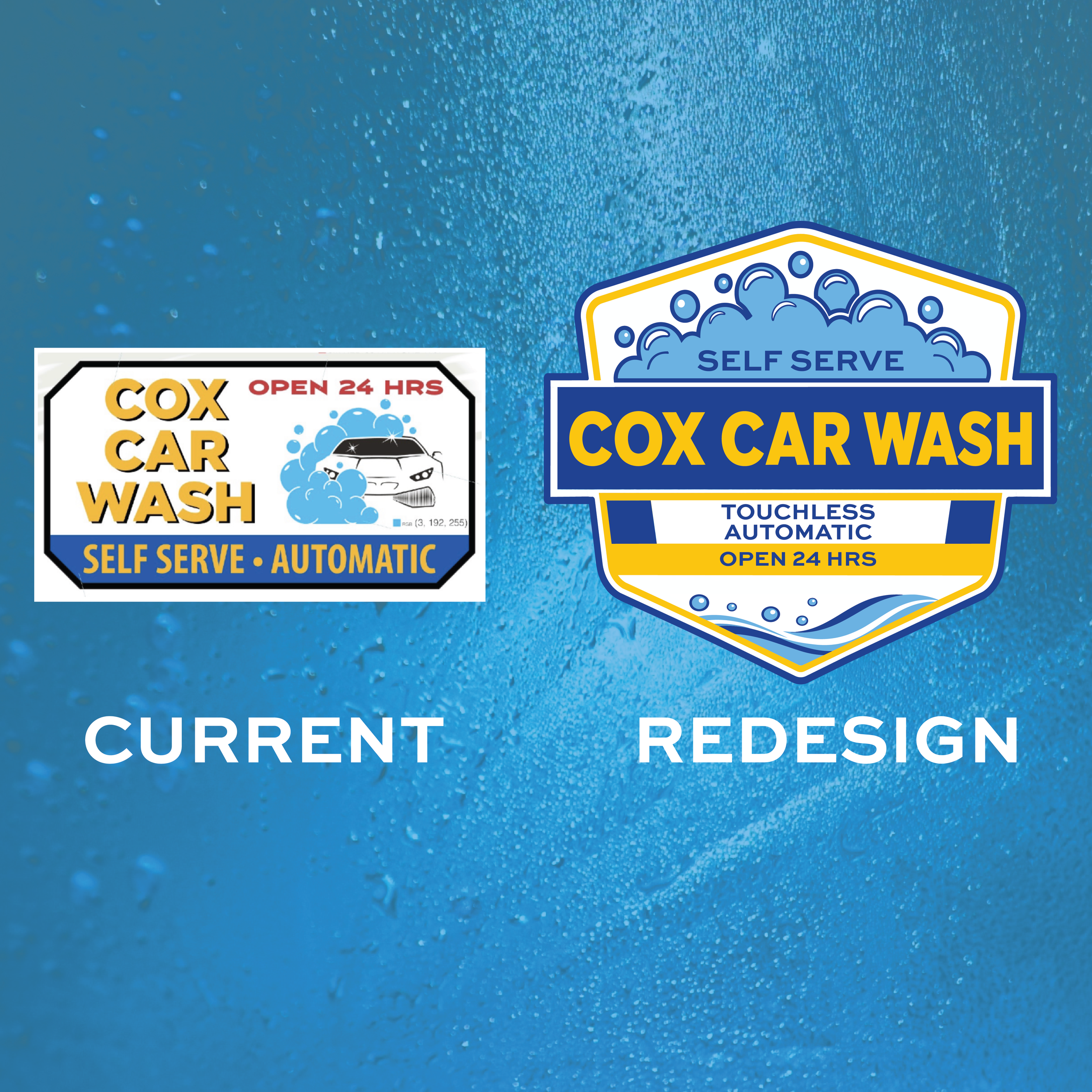
Project Goal: To redesign and modernize the visual identity for Cox Car Wash into a crisp, high-impact emblem. The goal was to transform an outdated, cluttered layout into a cohesive, versatile badge system that improves brand recognition, enhances legibility from a distance, and translates seamlessly across both physical site signage and digital media.
Key Requirements:
Visual Modernization: Streamline legacy elements (clip art, scattered text blocks, inconsistent outlines) into a clean, unified shield structure.
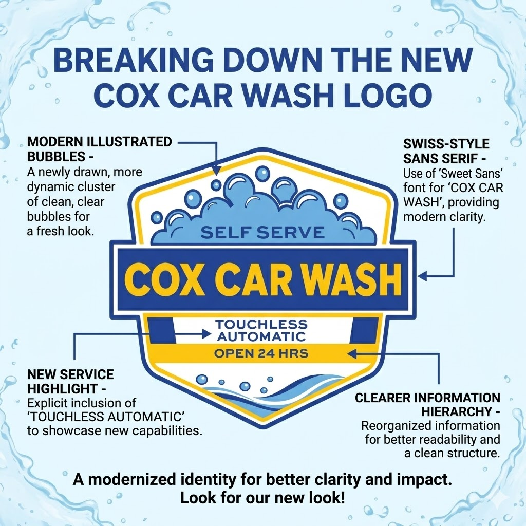
Information Hierarchy: Organize essential service offerings (Self Serve, Touchless Automatic, Open 24 Hrs) logically around the main brand name without cluttering the primary mark.
Color Palette Alignment: Utilize a high-visibility automotive color scheme (royal blue, vivid yellow, sky blue, and crisp white) to create vibrant contrast and energetic brand presence.
Legibility & Impact: Select strong, bold typography to ensure the brand name and service details remain instantly readable to drivers traveling at high speeds.
Scalability & Versatility: Construct a self-contained emblem engineered to work cleanly across solid backgrounds, window decals, apparel, and backlit sign cabinets.
Concept & Creative Strategy
Concept: "Clean Hydro-Shield Emblem." The strategy centered on housing the brand identity within a bold hexagonal shield, establishing a sense of reliability and professional quality while providing a clean container for all visual elements.
Layout Strategy:
Central Banner: Positioned COX CAR WASH inside a heavy horizontal blue bar that cuts across the center, acting as the immediate focal anchor.
Tiered Service Placement: Arranged secondary callouts strategically—nestling "SELF SERVE" inside the top soap suds, while staging "TOUCHLESS AUTOMATIC" and "OPEN 24 HRS" in structured lower bands.
Fluid Accents: Framed the top with layered bubble clusters and the bottom with dynamic water waves to instantly communicate foam, water, and automotive detailing.
Color Palette: A vibrant combination of Deep Royal Blue (grounding structure), Solar Yellow (high-visibility name and banner accents), Sky Blue/Cyan (water dynamics), and White (negative space separation).

Logo Rebranding & Signage for Cox Car Wash

Design Process & Role
Asset Curation & Vectorization: Re-built the identity from scratch, eliminating low-resolution raster elements (such as the legacy car clip-art) and creating custom, mathematically precise vector graphics for the bubble clusters and wave bases to ensure infinite scalability for large-format outdoor printing.
Typography & Hierarchy:
Primary Brand Font (Montserrat Black / Futura Bold): Selected an ultra-heavy, geometric sans-serif for "COX CAR WASH" to deliver maximum visual punch, solid stroke weight, and immediate readability from long distances.
Secondary Text Font (Montserrat Bold / Proxima Nova): Employed a clean, wide-set sans-serif with extended tracking (letter spacing) for "SELF SERVE", "TOUCHLESS AUTOMATIC", and "OPEN 24 HRS". The open spacing prevents letters from running together when rendered on illuminated street signage or scaled down for smaller merchandise.
Production Coordination: Engineered production-ready vector master files (AI, EPS, SVG, print-ready PDF) with precise contour cut lines, color-matched Pantone swatches, and clear safety margins for vinyl plotters, wrap installations, and building sign replacements.
Seeing a design transition from artboard to high-visibility physical signage is the ultimate test of scale, contrast, and production execution.
1. On-Site Implementation & Large-Format Banners
Street-Level Visibility: The redesigned logo emblem was integrated directly into Cox Car Wash’s promotional street banners (including the "Best of the Fox 2026" reader choice award banners).
Environmental Legibility: The bold geometric structure and high-contrast color palette hold up under direct sunlight and high ambient outdoor glare, delivering immediate brand recognition for passing traffic.
Cohesive Touchpoints: Seeing the new mark paired seamlessly alongside mobile app pay-station boards and entrance signage reinforced a unified customer experience across the entire physical facility.
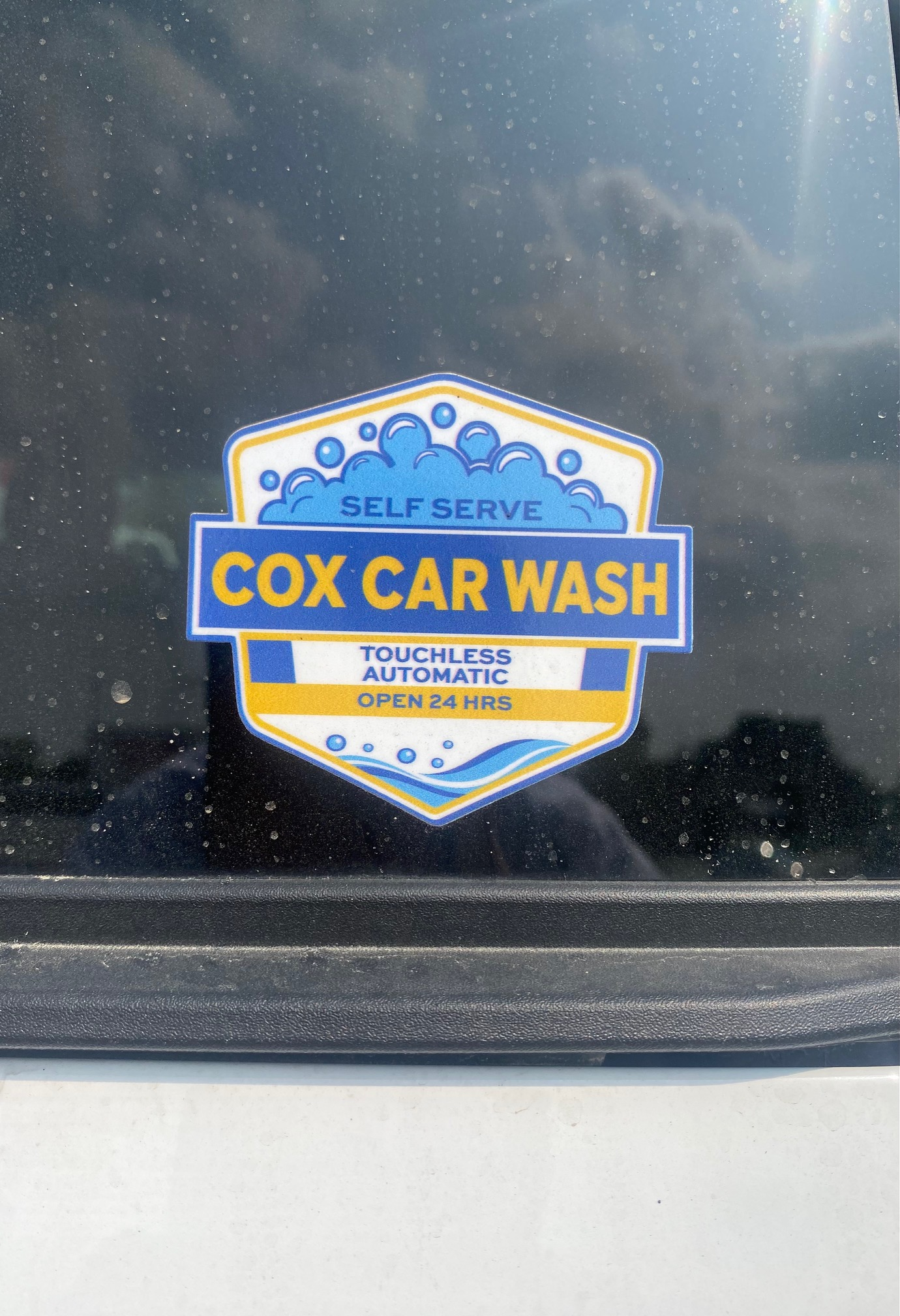
2. Small-Scale Decals & Vinyl Production
Precision Vector Calibration: Physical printed proofs and custom die-cut vinyl stickers demonstrate the design's scalability.
Fidelity Across Scales: The line weights, bubble details, and tracked-out typography remained crisp and readable—proving the mark works just as effectively on small decals as it does on large-format outdoor signage.
Key Takeaways
Versatility is Paramount: Designing within a structured emblem/shield container ensured the logo could adapt effortlessly across vastly different media—from printed promotional banners on light poles to die-cut adhesive vinyl and digital app displays.
Production-First Mindset: Calibrating stroke widths, vector paths, and color separation early in the design process saved time during production, eliminating issues during vinyl plotting and large-format printing.
Real-World Impact: Modernizing the visual identity helped elevate the business’s local presence, giving a trusted community staple a modern, professional look that matches the quality of their service.
Project Impact & Real-World Application