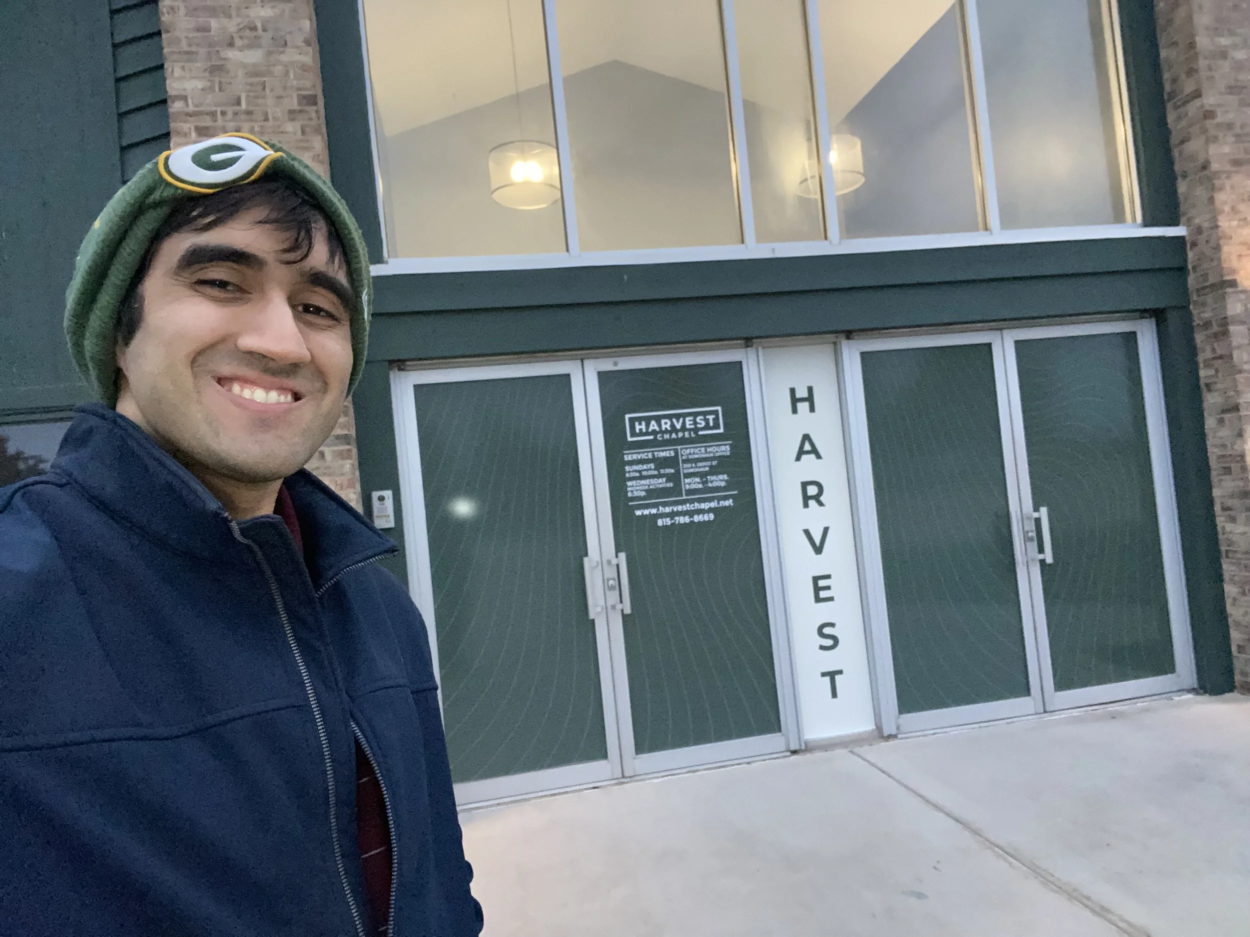
Client: Harvest Chapel
Project Goal:
To design and produce new, modern, and cohesive large-format window graphics for the main entrance doors of Harvest Chapel, effectively communicating the church's identity, key information (like service times), and creating a more welcoming street presence.
Key Requirements:
Modernization: Create a fresh, modern, and open aesthetic, moving away from older or less cohesive signage.
Clear Communication: Clearly display the church name, essential service times, website, and phone number.
High Contrast & Legibility: Utilize high-contrast text for ultimate legibility, complemented by a subtle, flowing pattern to reflect a sense of community and movement (as described in your Instagram caption).
Strategic Layout: Strategically place the design (as seen in the artwork proof) to maximize impact while retaining clear visibility and natural light flow into the building.
Material Specification: Design for a specific material—a little vinyl—for exterior application.
Concept & Creative Strategy
Concept: "Fresh, Modern, and Open." The strategy was to use negative space and a contemporary font treatment to make the church feel accessible and part of the surrounding community.
Layout Strategy: The design leverages the four door panels and the central vertical window to create a clear informational hierarchy:
Panels 1, 2, 4 (Doors): Feature a repeating, subtle green/dark vinyl pattern or tint to provide privacy and aesthetic consistency.
Panel 3 (Center Window/Sidelite): The primary focus area. It contains the church's logo, full name, service times, and contact information, ensuring this critical data is centrally located and easy to read.
Central Column (Between Doors): Features the high-contrast vertical display of the word "HARVEST" to maximize curb appeal and branding visibility.
Color Palette: A simple, high-contrast palette of white typography/logo against a dark (likely tinted or dark green) vinyl background ensures maximum readability and a professional, contemporary feel.
Harvest Chapel: Exterior Door Graphics
Design Process & Role
Information Architecture: Organized the required text (logo, service times, contact info) into a clear, hierarchical list for the central informational panel, prioritizing service times for community relevance.
Layout Development: Developed the precise layout using a grid system within the door and window dimensions (30.75 in x 77 in for the doors, 16.5 in x 84 in for the central column). The layout had to account for the physical break between the panels to ensure the overall design was continuous and impactful.
Proofing & Revision: Created the ARTWORK PROOF APPROVAL document, which includes critical dimensions, material notes, and a clear call-out for customer approval. This step ensured 100% accuracy on all text (times, dates, phone numbers) before production.
4. Print Production Handoff: Prepared the final, vectorized artwork files with exact measurements and color specifications for the vendor, Signs By Tomorrow (SBT), Plainfield. This included detailing the type of vinyl specified ("little vinyl" noted in the brief) for production and installation.


